From Fashion to Furniture, We’ve Got You Covered with Viva Magenta!
Pantone Color Institute has announced a “Color of the Year” for over two decades that sets the trend for design, fashion, and art industries worldwide. This annual declaration reflects the current social and cultural climate and guides creatives to incorporate the selected color in their projects.
The Pantone Color of the Year is more than just a prediction; it’s a statement that influences various sectors, from interior design to marketing campaigns, and is an essential indicator of the mood and attitude of the times.
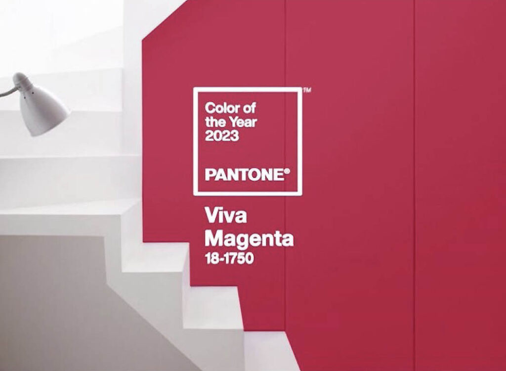
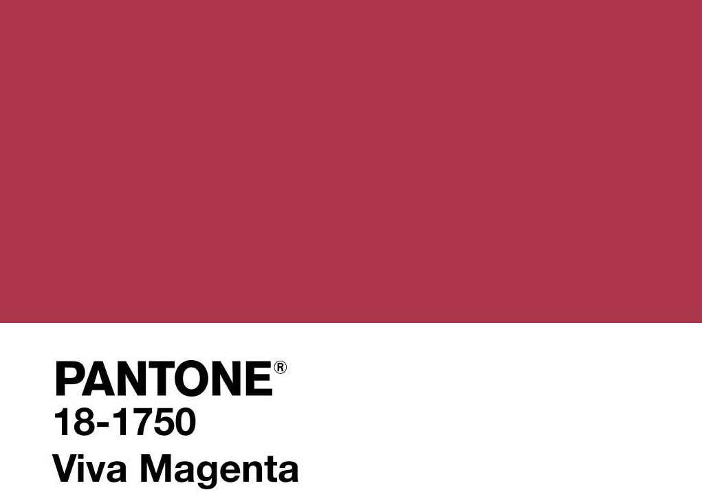
Pantone’s Color of the Year, Viva Magenta 18-1750, is lit! It’s a nature-inspired, red-based hue that screams strength. This year’s color is bold, fearless, and joyful, spreading positivity like “whoa.”
Viva Magenta is all about self-expression and taking risks. It encourages you to be yourself, take chances, and let your personality shine. It’s a color that makes you feel confident and ready to tackle anything that comes your way.
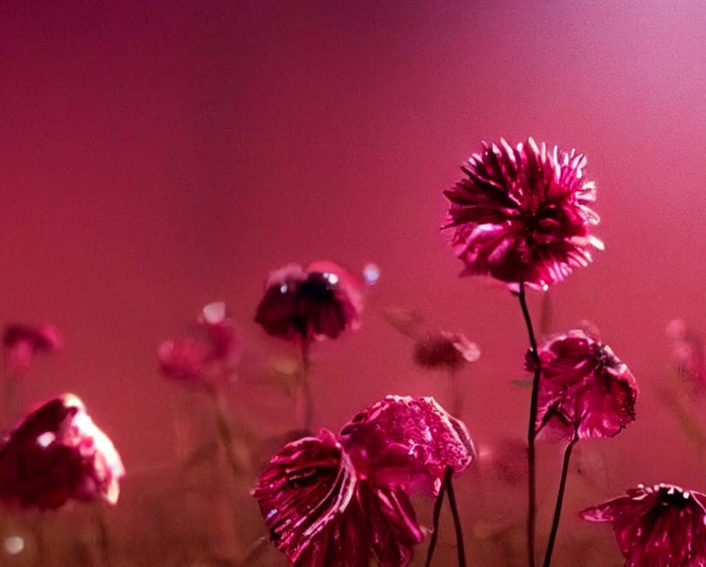
It’s a boundary-breaking, statement-making shade that welcomes everyone with open arms. It is a color full of life, wit, and inclusiveness, so bring on the vibes!
Who are the experts that choose the colors?
The experts involved in the Pantone Color of the Year selection process are color professionals, trend forecasters, designers, stylists, and other industry experts from various fields such as fashion, home furnishings, and graphic arts.
The Pantone Color Institute collaborates with various organizations, institutions, and other experts to gather insights and inspiration for the selection. The goal is to identify a color that reflects cultural and global trends and significantly impacts design and other industries.
“In this age of technology, we look to draw inspiration from nature and what is real. PANTONE 18-1750 Viva Magenta descends from the red family. It is inspired by the red of cochineal, one of the most precious dyes belonging to the natural dye family and one of the strongest and brightest the world has known,” says Leatrice Eiseman – Executive Director, Pantone Color Institute.
She explains, “Rooted in the primordial, PANTONE 18-1750 Viva Magenta reconnects us to the original matter. Invoking the forces of nature, PANTONE 18-1750 Viva Magenta galvanizes our spirit, helping us to build our inner strength.”
How many colors are typically chosen per year?
Typically, only one color is chosen as the Pantone Color of the Year each year. The selection process is a highly anticipated design event that generates significant media coverage and attention.
The chosen color is a crucial reference point and inspiration for designers, brands, and consumers, influencing fashion, product design, and other industries.
Are there also secondary colors chosen?
In addition to the primary Pantone Color of the Year, Pantone may also announce a complementary palette that supports and enhances the primary color. Secondary colors are chosen to create a harmonious and well-rounded story for the year. 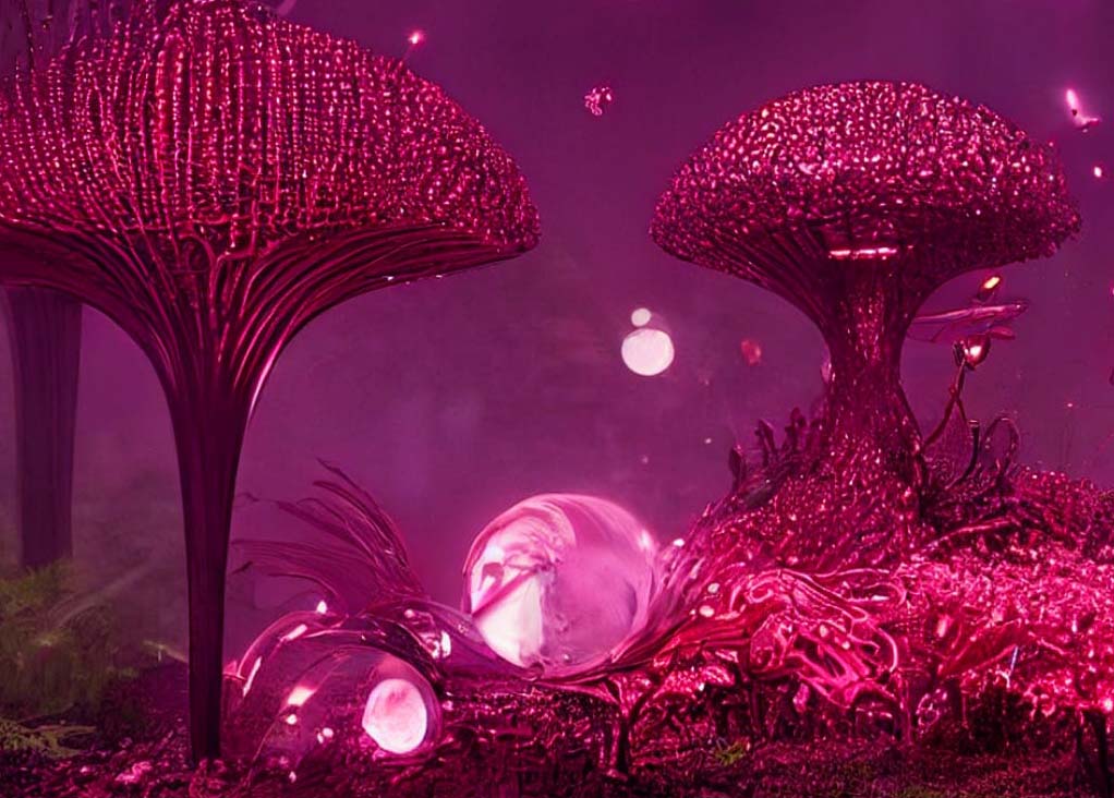
The secondary colors may include shades, tints, tones of the primary color, and other colors that complement and contrast with it. And secondary colors give designers a more comprehensive range of options and inspirations for their work.
How far ahead are colors chosen for the following year?
Pantone typically chooses the Color of the Year several months before the coming year.
The selection process considers various cultural, economic, and technological factors and requires research, analysis, and consultation with industry experts. The announcement is usually made in the fall, several months before the start of the new year.
The purpose is to provide designers, brands, and consumers ample time to incorporate color into their products, designs, and marketing materials.
What are past colors?
Here is a list of past Pantone Colors of the Year:
- 2023: Viva Magenta
- 2022: Veri Peri
- 2021: Ultimate Gray & Illuminating Yellow
- 2020: Classic Blue
- 2019: Living Coral
- 2018: Ultra Violet
- 2017: Greenery
- 2016: Rose Quartz & Serenity
- 2015: Marsala
- 2014: Radiant Orchid
- 2013: Emerald
- 2012: Tangerine Tango
- 2011: Honeysuckle
- 2010: Turquoise
- 2009: Mimosa
Note: This list includes colors chosen starting from the year 2009. The list is incomplete, and other colors may be selected from earlier years.
Does Pantone create their colors or go off existing ones?
Pantone creates its colors. The Pantone Matching System (PMS) is a proprietary color space used to identify, match, and communicate specific colors.
Pantone creates and maintains its library of over 1,800 standardized colors, each with a unique PMS number. The colors are made through a carefully controlled process that ensures consistency and accuracy across various media, including print, digital, and textiles.
The PMS system provides a universal language for color communication, allowing designers, printers, and manufacturers to collaborate confidently and consistently.
The Pantone Color of the Year is chosen from this library of standard colors, and maybe a new or existing color has been selected for its relevance and impact on design and culture.