The Rise of Moody Holiday Reds: Styling Burgundy, Wine, and Maroon for the Season
There’s a secret society of colors that gathers quietly each winter—shades that aren’t as loud as holly-berry red or as predictable as candy-cane stripes. They slip in through candlelit moments, festive tables, velvet dresses, and the corners of holiday décor that crave a little sophistication. Their names sound like characters from an old-world novel: Burgundy, Wine, and Maroon—three hues cut from the same cloth, sometimes with only subtle differences, each carrying its own story, its own temperature, its own mood.
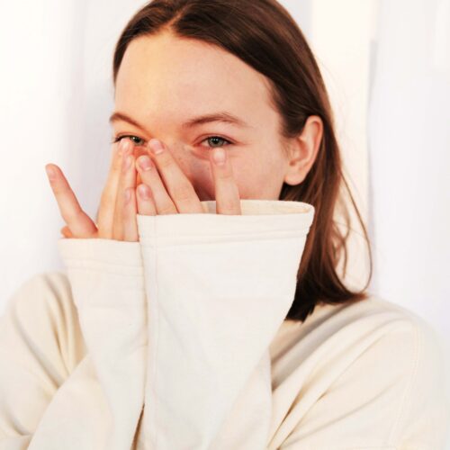
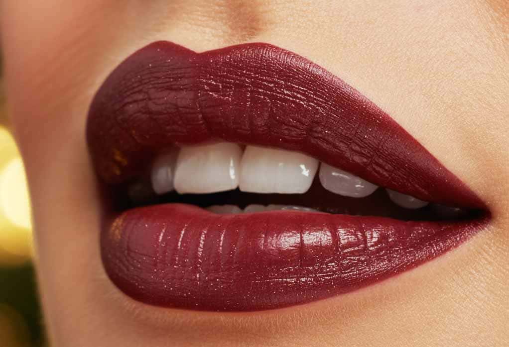
Burgundy is the romantic of the group, always showing up at the holidays like a guest who knows exactly what to do with a taper candle and a linen napkin. It’s the shade of deep-tinted lips, velvet bows, and heavy curtains that soften the edges of winter. Burgundy doesn’t shout for attention; it invites it. It is the color of gatherings where the lights glow low, conversation hums warm, and a glass is always half-full with something rich and earthy. Burgundy is timeless—neither trendy nor tired—just eternally relevant, like a song you don’t remember learning but somehow know all the words to.
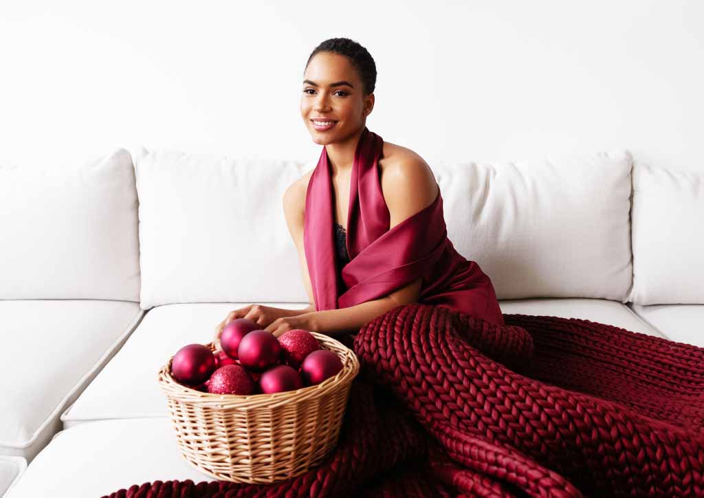
Wine, on the other hand, is Burgundy’s playful sister. She has warmth, wit, and a little bit of a sparkle. She’s the color of clinked glasses, berry-kissed holiday desserts, and cheeks that flush after laughing too hard with friends you haven’t seen since last December. Wine carries the comfort of connection and the sweetness of moments that linger long after the guests have left. It’s a hue that feels celebratory without trying—warm but not hot, bold but not brash. Wine knows that the best parts of the holidays aren’t always the planned ones, but the spontaneous joy that rises like bubbles in a glass.
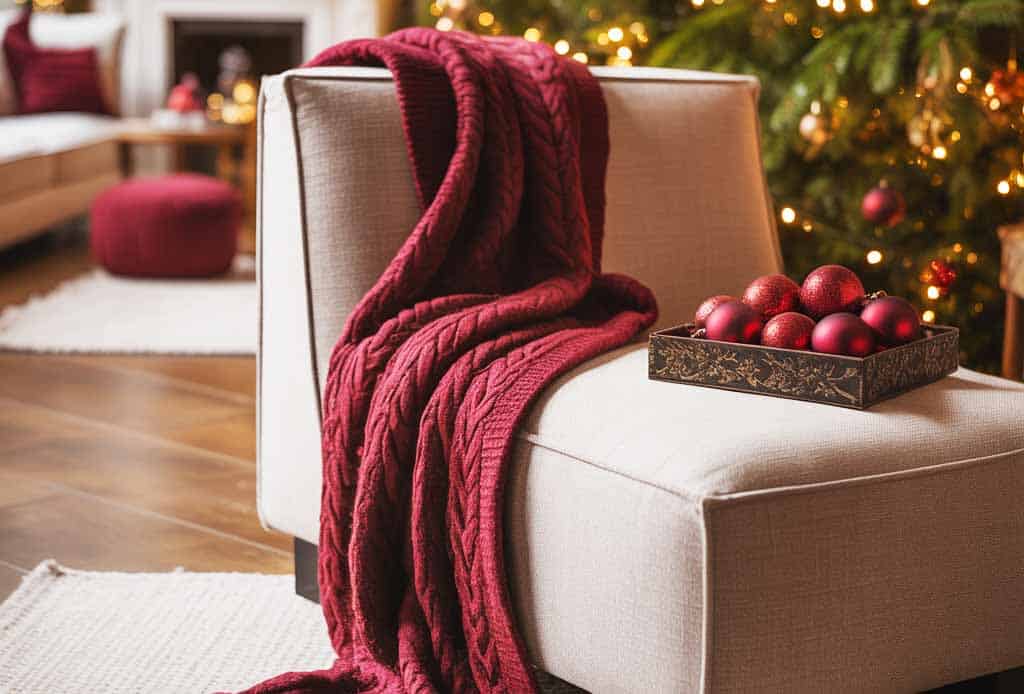
Then there’s Maroon—the grounded one. The quiet strength. Maroon is the shade of assurances, deep traditions, and the kind of holiday magic that doesn’t glitter but endures.
It’s the color of knitted blankets that have lived in the family for generations, of heirloom ornaments with backstories, of handwritten cards with ink pressed a little harder than necessary. Maroon is depth. Maroon is calm. Maroon is the feeling of sitting by a fire after a long day, finally exhaling. If Burgundy romanticizes the season and Wine celebrates it, Maroon stabilizes it.
Together, they form the trio of holiday reds that whisper instead of shout. They offer elegance where bright red demands cheer. They bring depth where classic holiday palettes offer simplicity. They are for people who prefer their holiday décor a little moodier, their outfits a little richer, and their celebrations a little more meaningful.
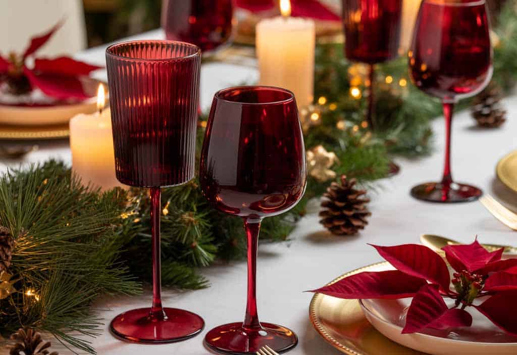
Think of a table dressed in these tones: a Burgundy table runner, Wine-colored glassware catching candlelight, Maroon napkins folded with understated care. The scene feels almost old-world, almost cinematic, like you’ve stepped into a moment that wants to be remembered.
These colors are confidence. They’re the feeling of knowing who you are without needing to explain it. They are holiday warmth without holiday noise.
But what makes them especially magical is how they pair with the season’s natural elements. Evergreen branches deepen next to Burgundy. Gold shimmers more boldly beside Wine. Cream linens soften beautifully under Maroon. Even snowy whites feel more intentional, more serene, when grounded by these deeper reds.
Maybe that’s why people are drawn to them lately—they offer something different from traditional holiday red. Something grown-up. Something soulful. Something that feels like holiday spirit, but with a sense of story and texture.
As the season unfolds, these hues step forward—not to replace the iconic reds of December, but to expand the palette. To give people permission to celebrate the holidays in a way that’s a little moodier, a little richer, a little more themselves.
Because sometimes, the most memorable colors aren’t the ones that shout the loudest—but the ones that stay with you, quietly, long after the season fades.